Amy earlier showed the graph that was used on Insiders yesterday during the interview with Anthony Albanese of the Budget Deficit.
It was a pretty disingenuous graph that committed a series of graph crimes.
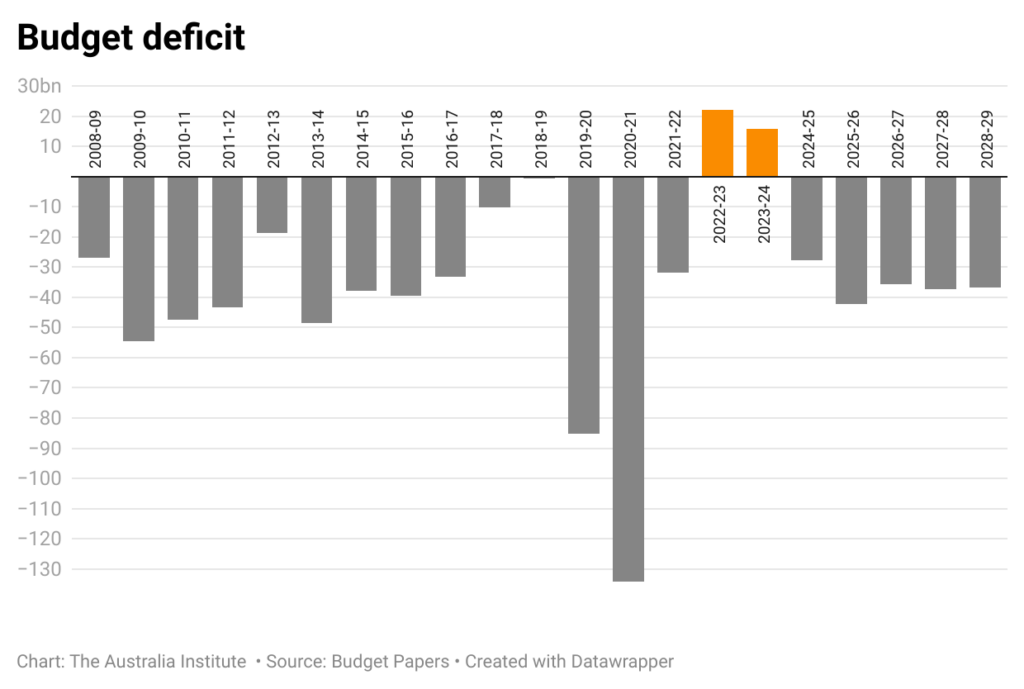
The first was to use nominal dollars, when the most sensible way to look at any budget numbers is to use a percent of GDP – as this shows the size of debt (or anything) compared to the size of the whole economy and accounts for inflation. You could also argue that using blue for surplus and red for deficits made it look like the surpluses were the LNP (blue) and the deficits were ALP (red). This probably was not the intention, but it could have been cleared up with more context.
This is the big issue with the graph – the lack of context. The Insiders graph starts in 2022-23, which was when the budget was in surplus for the first time in 15 years the budget was in surplus. But starting it there makes it looks like that is the norm. A good graph should always provide as much context as is necessary to ensure you are not presenting a biased view. Yes, there are budget deficits forecast, but hardly out of step with what has been the case since 2007.
So even if we were to use nominal dollars, Insiders could have given its audience more information by showing this graph instead. Sure, it would make it less of a gotcha for when interviewing the PM, but surely journalism should be about informing the viewer or reader?
No comments yet
Be the first to comment on this post.