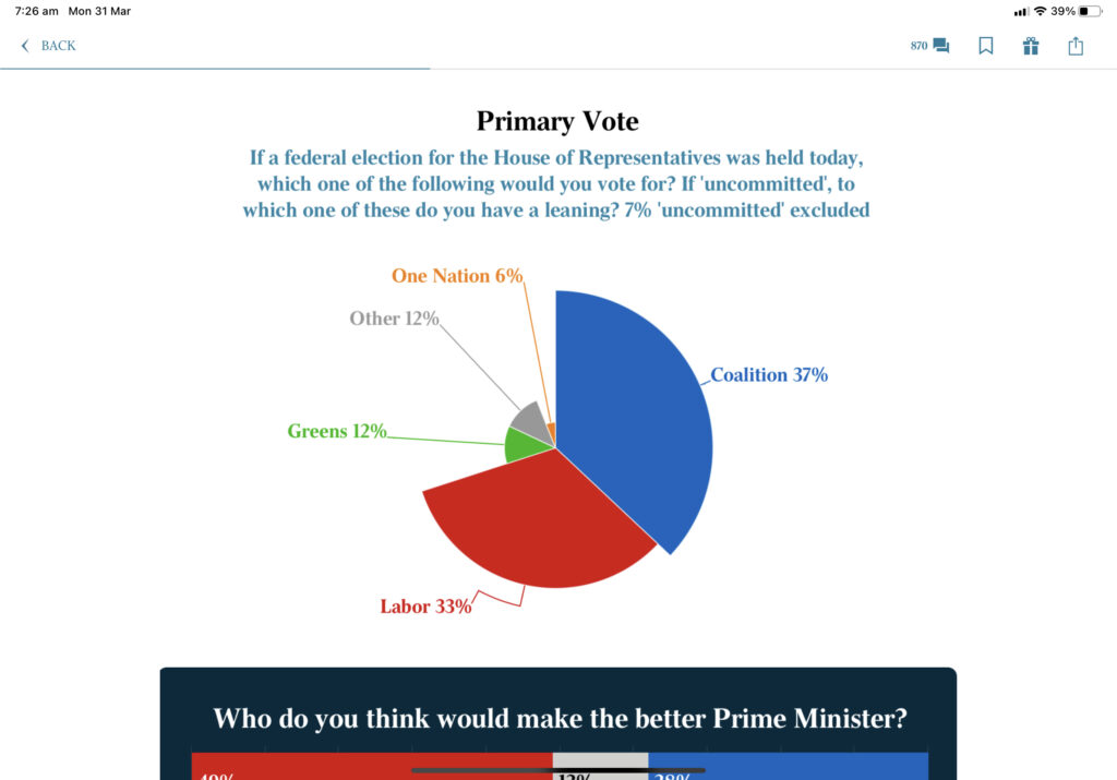
Meanwhile, in graph crimes, here is how the Australian chose to illustrate the breakdown of first preference votes.
The Coalition is only 4% ahead of Labor in terms of primary vote. Is that what this looks like though? The Greens and ‘other’ are on 12%, which together is a significant wedge – but is that what you would take from this?
It’s just another way that media can slightly alter how you view things – you see the number, sure, but you are left with the impression of the slice of the pie, which is deliberately outsized in this example.
No comments yet
Be the first to comment on this post.